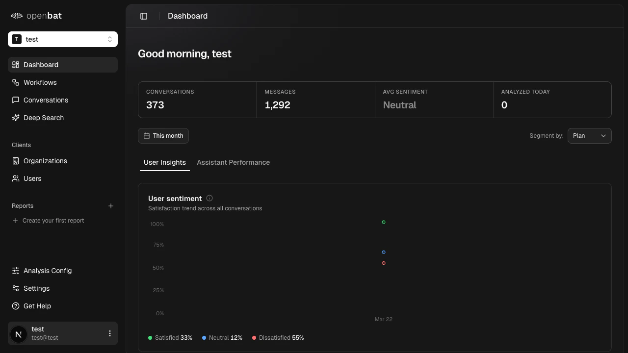
This tab answers: who are your most frustrated users, what are they asking about, and what is driving dissatisfaction?Sentiment bands over time
A stacked area chart shows the daily breakdown of conversations by sentiment band:| Band | Score range | What it captures |
|---|
| Satisfied | Greater than +0.2 | Users having a good experience |
| Neutral | -0.2 to +0.2 | Neither positive nor negative interactions |
| Dissatisfied | Less than -0.2 | Users experiencing friction or frustration |
Dissatisfied users
A ranked list of up to 8 users with the worst average sentiment in the current period. For each user you see:
- Name and email
- Average sentiment score
- Conversation count
- Dissatisfaction score (a composite ranking metric)
Treat this as your “who to call” list. Customer success teams use it to proactively reach out before users churn.
Top frustrations
The topics most associated with negative sentiment conversations, ranked by frustration signal strength. For each topic:
- Display name
- Occurrence count
- Trend percentage vs. the prior period (growing or shrinking frustration)
Use this to identify the product areas or question types generating the most friction.Support topics
All topics detected across the period, not just negative ones. This shows the full distribution of what users are asking about, ranked by volume. For each topic:
- Display name
- Count
- Trend percentage vs. the prior period
- Whether the topic is auto-discovered or predefined
Auto-discovered topics appear when the LLM encounters a recurring pattern not yet in your topic vocabulary. This is a signal that your topic list needs expanding. This tab answers: how well is your assistant performing, what behaviors is it exhibiting, and where is it failing?Response quality
A radar chart scores your assistant across 6 dimensions, each rated 0 to 1:| Dimension | Weight | What it measures |
|---|
| Relevance | 25% | Does the response address what was asked? |
| Completeness | 25% | Does it cover all parts of the question? |
| Clarity | 20% | Is it easy to understand? |
| Accuracy | 15% | Is the information correct? |
| Conciseness | 10% | Is it appropriately succinct? |
| Tone Match | 5% | Does it match the user’s register and tone? |
Behavior alerts
The most frequent problematic assistant behaviors, ranked by severity:| Behavior | Severity |
|---|
hallucinating | Critical |
dodging | High |
yes_man | High |
over_apologizing | Medium |
redirecting | Medium |
verbose | Medium |
robotic | Low |
helpful | Positive (not an alert) |
hallucinating count is an immediate red flag that requires investigation.Check behavior alerts daily. A single critical alert like hallucinating can erode user trust faster than any other quality issue.
Resolution outcomes
How conversations end, broken into outcome categories with percentages and period-over-period deltas:| Outcome | Description |
|---|
fully_resolved | The user’s question was answered completely |
partially_resolved | Some but not all of the question was addressed |
deflected | The assistant redirected the user elsewhere without resolving |
capability_failure | The bot encountered something it could not handle |
incorrect | The bot gave a wrong answer |
other | Does not fit the above categories |
(fully_resolved + partially_resolved) / total.Capability gaps
Topics where the assistant most frequently reaches capability_failure. These are the things users ask for that the bot cannot do. For each gap:
- Topic name
- Request count
- Unique users affected
- Trend vs. the prior period
Use capability gaps as direct input for your product roadmap. They tell you exactly what users need that you have not built yet.